주요 학습 내용 요약
pandas 보충으로 기억하고 있을 내용
pandas 데이터 통계
- median()
- agg([함수1, 함수2, 함수3,...]) #모든 열에 여러 함수, ({'열1':함수1, '열2':함수2,...})
- value_counts()
데이터 시각화 라이브러리 matplotlib
- 하나를 입력하면 y값으로 인식, x값은 기본적으로 0,1,2..으로 생성
- xlim([min, max]), ylim([min, max]), axis([xmin, xmax, ymin, ymax])
- legend(loc='upper right', ncol=2)
- tight_layout() 그래프를 그릴때 충분한 여백이 있도록 출력해줌. subplot때 사용하기 좋음
- 선종류 설정
: '--',':','-.' 바로 입력 or linestyle='dotted'
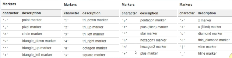
- marker 설정
'ro' => red+o, $A$ => A로 표기
- color 설정
- title설정
: title('name', loc='center or left or right')
- bar 그래프
: plt.xticks(x, [new x]) # x축을 수정할 수 있음
: width # 바의 너비 설정 가능
- scatter
+ np.random.seed(0) # 랜덤값 고정, x = np.random.rand(n)
- 그래프 종류
: bar() 막대, barh() 수평막대, scatter() 산점도, hist() 히스토그램, errorbar() 에러바, pie() 파이차트, matshow() 히트맵
- plt.subplot(row, column, index)
: figure와 axes값을 반환, f = 전체 subplot의미, axe = 낱낱개를 의미,
: twinx() ax1과 축을 공유하는 새로운 axes 객체 생성
: fig, ax1 = plt.subplots() / ax1.plot () 이렇게 그림
: 같은 축을 공유하는 그래프를 더 그리고 싶을 때 ax2 = ax1.twinx() / ax2.bar ()
+ np.cos, np.sin, np.pi
- plt.figure(figsize=(width, height))
ax1 = fig.add_subplot(1,2,2)
ax2 = fig.add_subplot(1,2,2)
Seaborn
https://seaborn.pydata.org/examples/scatterplot_categorical.html
Scatterplot with categorical variables — seaborn 0.13.2 documentation
Scatterplot with categorical variables seaborn components used: set_theme(), load_dataset(), swarmplot() import seaborn as sns sns.set_theme(style="whitegrid", palette="muted") # Load the penguins dataset df = sns.load_dataset("penguins") # Draw a categori
seaborn.pydata.org
- data = sns.load_dataset('file_name')
- regplot()
: 선형회귀선이 있는 산점도 시각화
: x, y, data, axe 객체, fit_reg 선형회귀선 표시여부 = True, False
- distplot()
: 히스토그램과 커널 밀도 그래프 시각화
: hist = True는 히스토그램 표시
: kde = True는 커널 밀도 그래프 표시
: axe 객체
- hisplot()
: 하나의 변수 데이터의 분포를 확인할 때 사용
- kdeplot()
: 그래프와 x축 사이의 면적이 1이 되도록 그리는 밀도 함수
- sns.distplot(data, ax=ax1) 객체 설정
- stripplot()
: 데이터 포인트가 중복되어 범주별 분포를 시각화
: x, y, data, axe, hue 특정 열 데이터로 색상을 구분하여 출력
- swarmplot()
: 데이터의 분산까지 고려하여 데이터 포인트가 서로 중복되지 않도록 시각화
: x, y, data, axe, hue 특정 열 데이터로 색상을 구분하여 출력
- countplot()
: 각 범주에 속하는 데이터의 개수를 막대 그래프 시각화
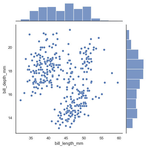
- joinplot()
: 산점도를 기본, x-y축 각 변수에 대한 히스토그램 동시 시각화
: x, y, data, kind='reg' 선형회귀선, kind='hex' 육각산점도, kind='kde' 커널밀집그래프
- pairplot()
: 데이터의 열을 두개씩 짝 지을 수 있는 모든 조합에 대해 표현
: 열을 정수/실수형
: 같은 변수에는 히스토그램, 서로 다른 변수 간에는 산점도
'패스트캠퍼스' 카테고리의 다른 글
| [패스트캠퍼스] 데이터 분석 부트캠프 17기 - 5주차 (8) Netflix 분석 (0) | 2025.01.15 |
|---|---|
| [패스트캠퍼스] 데이터 분석 부트캠프 17기 - 5주차 (7) BeautifulSoup (0) | 2025.01.14 |
| [패스트캠퍼스] 데이터 분석 부트캠프 17기 - 5주차 (5) 타이타닉 분석 (0) | 2025.01.14 |
| [패스트캠퍼스] 데이터 분석 부트캠프 17기 - 5주차 (4) 바이크 분석 (0) | 2025.01.14 |
| [패스트캠퍼스] 데이터 분석 부트캠프 17기 - 5주차 (3) seaborn (0) | 2025.01.14 |